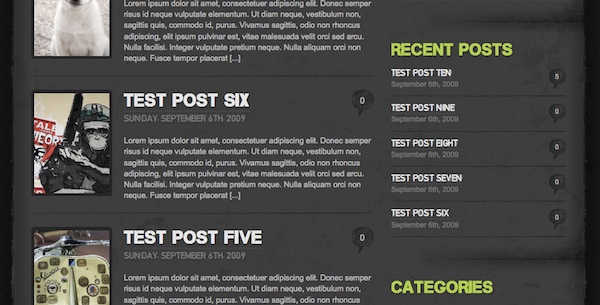
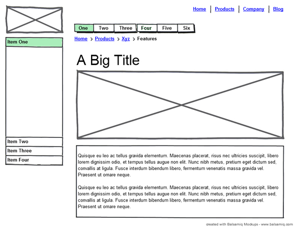
Anyone has designed a web site knows web design involves a lot of “boxes” like this wireframe shows here. So how do we separate those “boxes” or content areas in design? After doing some research I summerized a few methods usually used by designers.
Simplest straight lines
This goes well with minimalism design or clean corporate styles. For example these web sites here, used simple lines that have slight darker color than the back ground.
This technique usually used with slight color contrast on background as well.
Slightly lighter color lines on dark background design:
Use some slight variation if get bored of the lines
Make the lines disapear into the back ground towards the end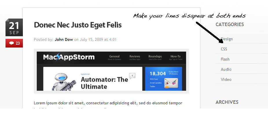
Use thicker bars if you really want the attention
Another example
Let pixels pop
If you want to get a subtle look use the pixel popping techniques introduced by tutorial9 along with some gradient from the top.
Separate the content with gaps
Colorful backgrounds goes well with this technique.
Thicker borders that have same color as the background can fake this effect too.
Using light or shadow as separator
Usually use light on dark background and shadow on light background to separate the content areas.
Improvise with your own style
Grunge/textured look needs some special attention and clever thoughts.